ART DIRECTION / MARKETING STRATEGYBrand Strategy/Marketing Positioning & Messaging
Role: Brand Strategy, Product Positioning, Messaging, Design
Industry: Apparel / Athletic Wear
Style: Minimalist, Athletic, Lifestyle, Relatable yet Aspirational
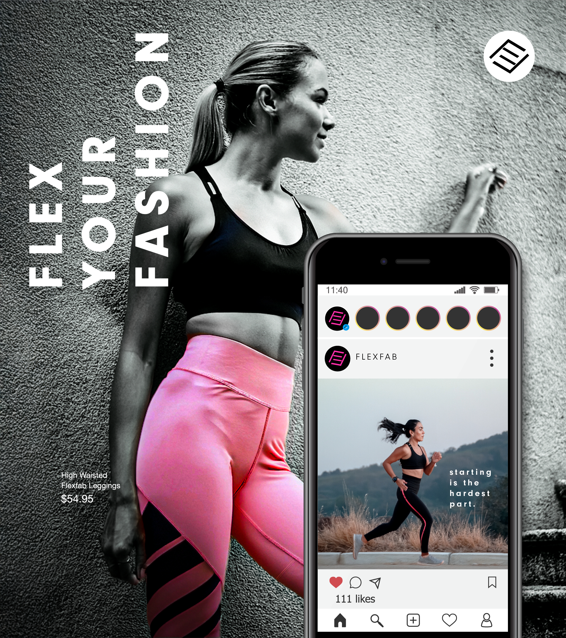
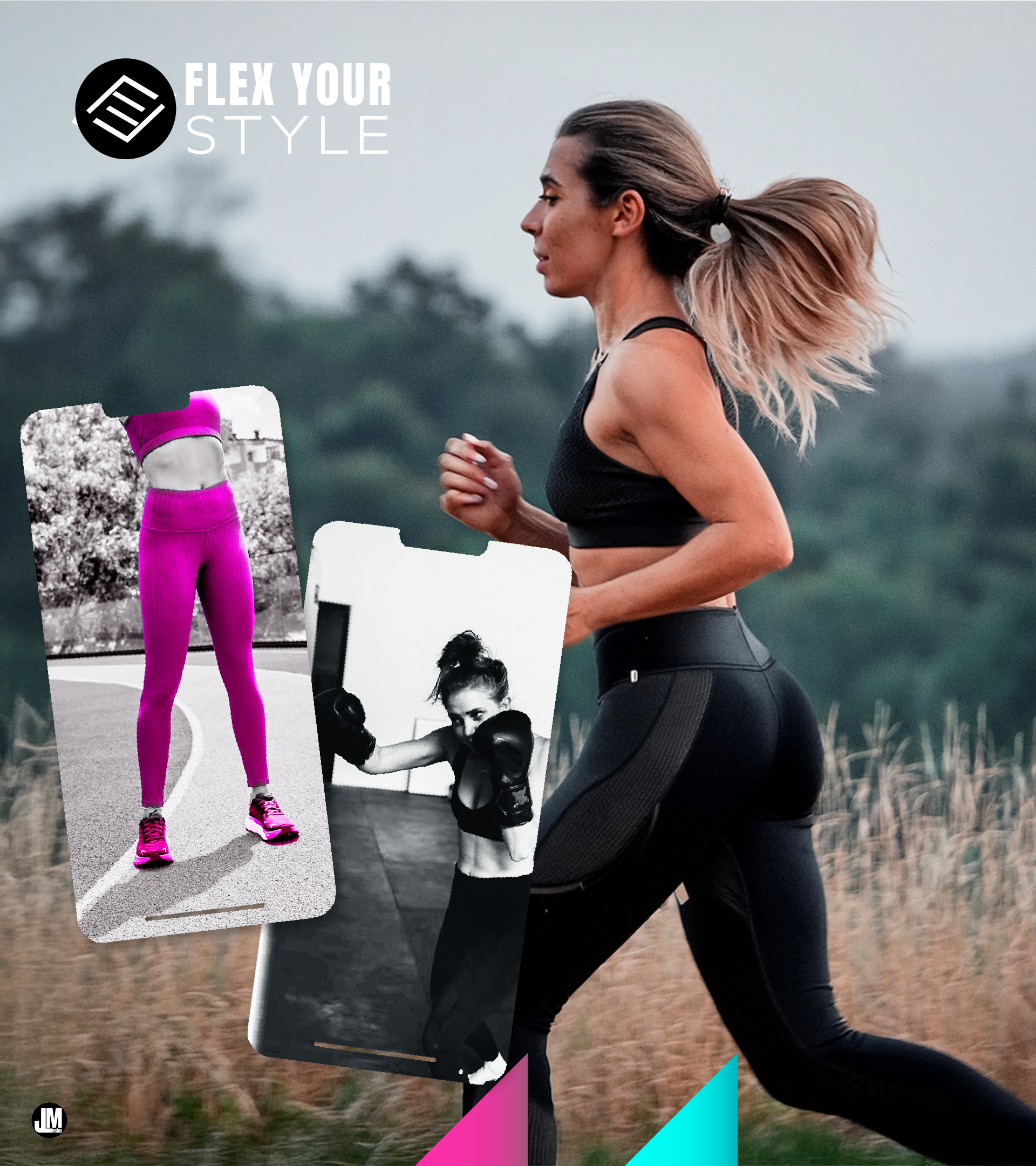
FlexFab is a minimalist athletic wear brand designed for versatility, apparel that performs in the gym while integrating seamlessly into everyday life.
FlexFab
Role: Brand Strategy • Positioning • Messaging • Brand Identity & Visual Design
Industry: Athletic Apparel
The Challenge
The athletic apparel market is crowded with brands making similar promises: better performance, better materials, better athletes. Visually, many rely on high-energy imagery and bold aesthetics to stand out.
The challenge wasn't simply designing another athletic brand—it was creating a reason for someone to choose it.
The question became:
What could FlexFab stand for that competitors weren't already claiming?
The Strategic Observation
As I looked across the category, I noticed most brands asked consumers to make a choice.
Performance or lifestyle.
Technical or fashionable.
Gym or everyday wear.
Yet many people don't actually live that way. They move between work, training, errands, and social settings throughout the day. Their clothing has to move with them.
That suggested a different opportunity.
Rather than competing on performance alone, FlexFab could compete on versatility.
Not apparel built only for the gym—but apparel designed to fit seamlessly into everyday life.
That insight became the foundation for every decision that followed.
Positioning the Brand
The positioning centered on a simple idea:
Minimalist performance wear for people who want one system of clothing that works across training and daily life.
Instead of chasing louder visuals or more technical claims, the brand emphasized adaptability, simplicity, and confidence.
The value wasn't just performance.
It was reducing the friction of deciding what to wear.
Bringing the Strategy to Life
Once versatility became the strategic direction, every element of the brand needed to reinforce it.
Messaging
Rather than leading with product specifications, the messaging focused on the role the apparel played in everyday life.
The story shifted from "high-performance athletic wear" to "designed to move with your life."
Throughout the customer journey, the messaging answered different questions:
Discovery: Why does this feel different from other athletic brands?
Consideration: How does this fit into my everyday routine?
Decision: Why is this a smarter purchase than buying separate clothing for different occasions?
But messaging isn't only about the information being communicated—it's also about the feeling it leaves behind.
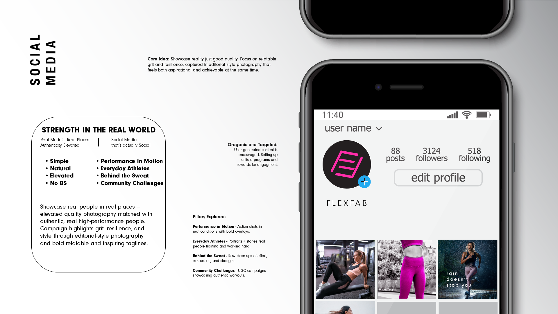
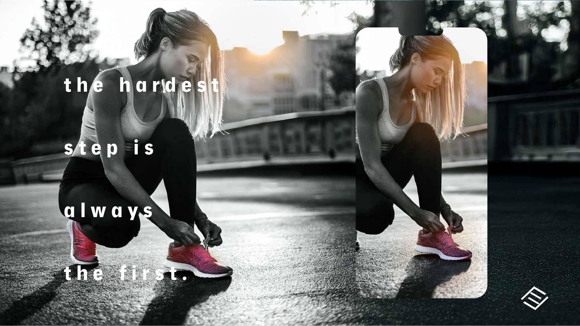
Because the brand was positioned around confidence and versatility, I developed a voice that felt encouraging, relatable, and quietly motivated. Rather than relying on aggressive performance language or elite fitness culture, the copy acknowledged the everyday experience of staying active.
Lines such as:
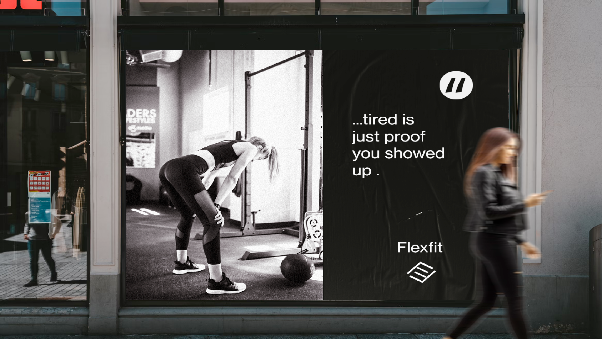
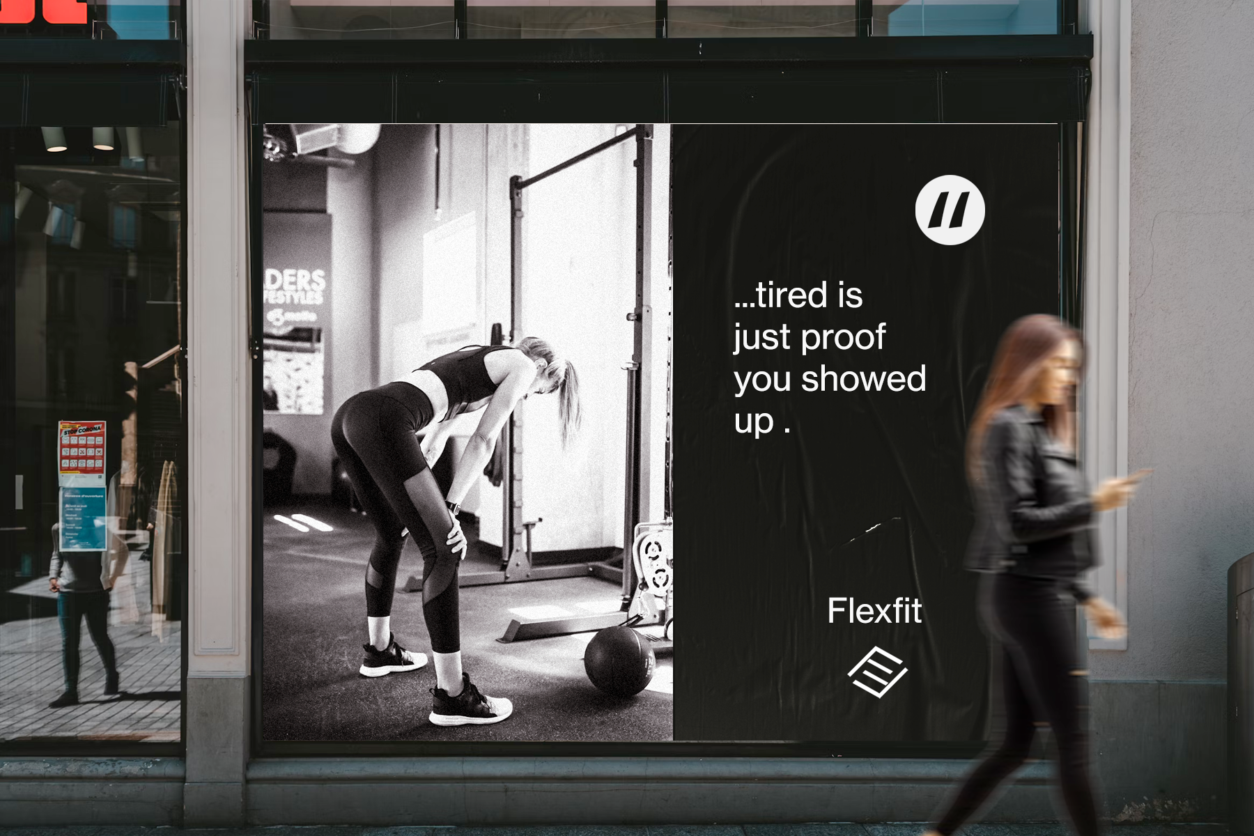
"Tired is just proof you showed up."
and
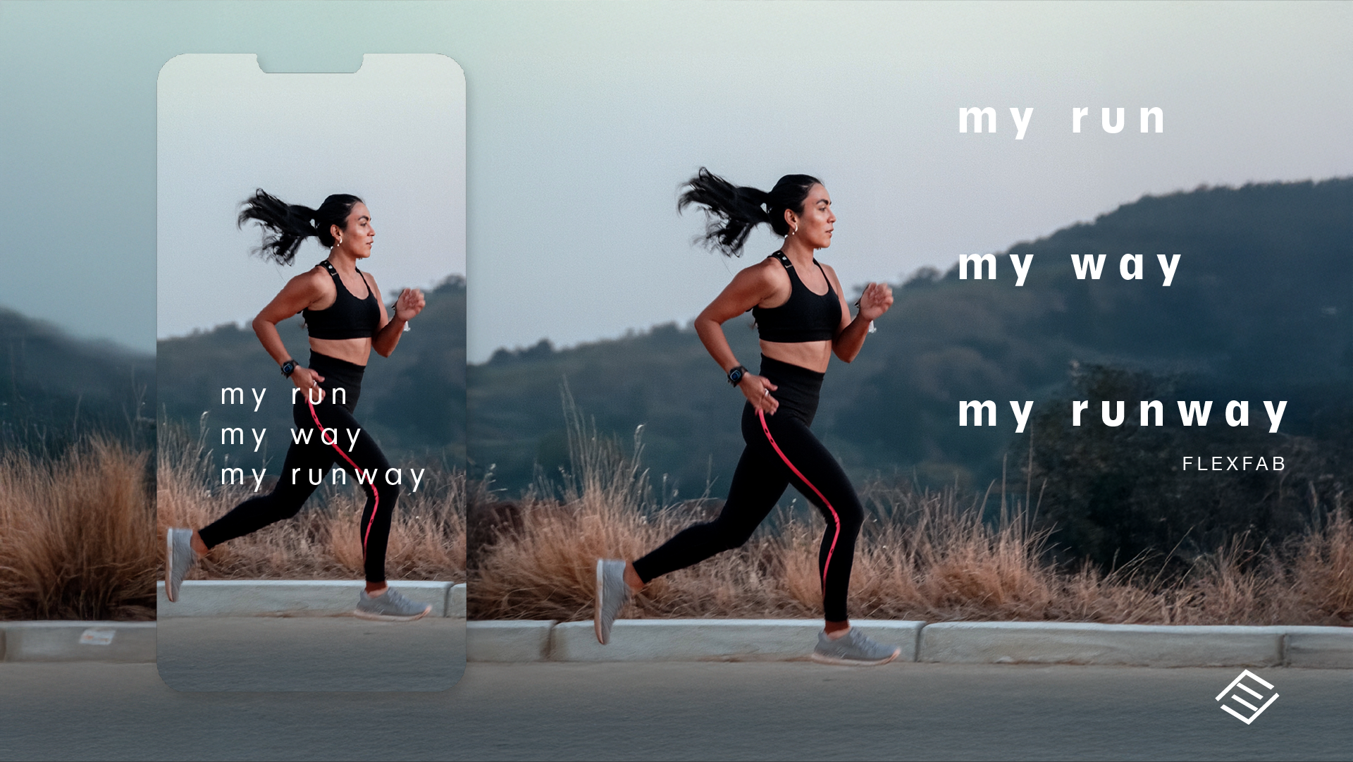
"My Run. My Way. My Runway."
helped express the brand's personality while reinforcing its positioning. The goal wasn't simply to describe the product, but to create messaging people could see themselves in—connecting movement with everyday life rather than treating fitness as a separate identity.
Visual Identity
The visual system wasn't minimalist simply as an aesthetic choice.
It was designed to support the positioning.
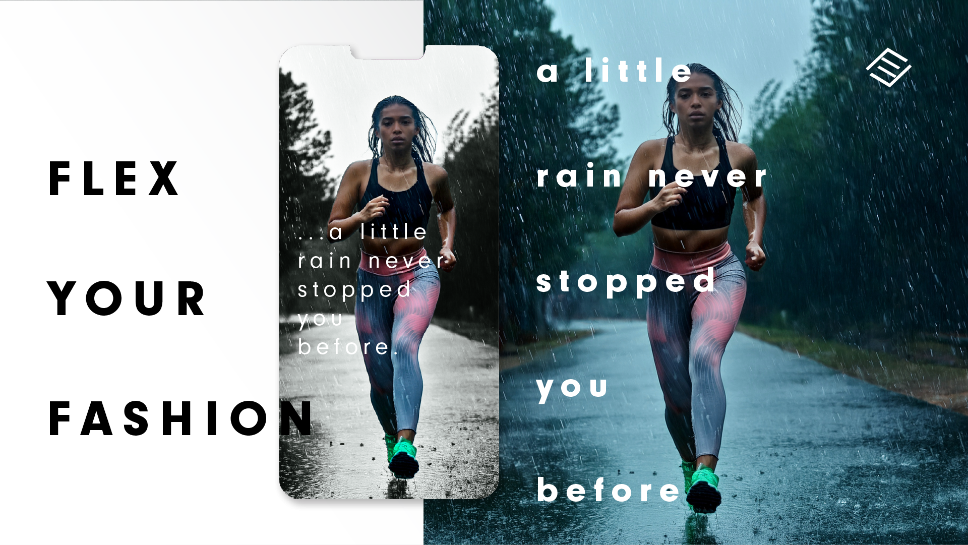
A restrained monochrome palette reduced visual noise and kept attention on the apparel itself. Strategic accent colors introduced energy without overwhelming the experience.
Product photography emphasized silhouette, movement, and construction over dramatic lifestyle imagery, helping communicate versatility and quality before a single word was read.
Every design decision reinforced the same strategic idea:
The product should feel equally at home in the gym, at work, or anywhere in between.
Building a Cohesive Brand System
Because the positioning was clear, it could extend consistently across multiple touchpoints.
The same narrative informed product storytelling, social content, campaign creative, and future marketing assets, creating a system that could scale without relying on changing design trends.
Rather than treating branding and marketing as separate activities, the goal was to create a consistent experience from first impression through purchase consideration.
Outcome
The project established a clearer position within a crowded market by shifting the conversation away from performance alone and toward versatility.
That strategic direction shaped not only the messaging, but the visual language, customer experience, and future marketing system—creating a brand designed to communicate the same idea at every touchpoint.
Reflection
Looking back, I'd be interested in testing how that positioning performs in market.
In particular, I'd want to compare messaging centered on performance against messaging centered on versatility to better understand which narrative resonates most strongly with different customer segments.
I'd also explore product comparison experiences and post-purchase communication to reinforce the idea of building a simplified, multi-purpose wardrobe rather than selling individual products.