
Breakside Brewery
ART DIRECTION / MARKETING STRATEGYBreakside Brewery
Role: Brand Strategy • Marketing • Positioning • Packaging Design • Messaging
Industry: Beverage / CPG
Breakside Brewery is an award-winning craft brewery with a strong, art-driven brand identity and deep roots in the Portland community.
During the pandemic, the business faced a critical shift:
Taproom-driven revenue declined significantly
Growth depended on scaling retail distribution through canned products
The opportunity was to reposition the brand and product experience for a retail-first environment, where packaging, messaging, and shelf presence directly influence purchase decisions.
The Challenge
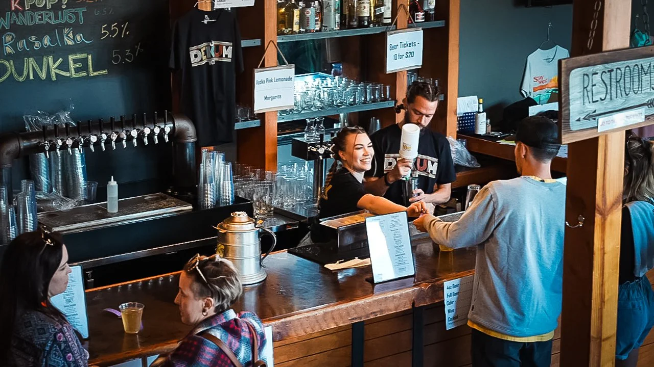
For years, Breakside's brand lived primarily through its taprooms.
People discovered the brewery through conversations with staff, the atmosphere, seasonal releases, and the experience of being there. The product was only one part of a much larger brand experience.
When the pandemic disrupted that experience, the context changed almost overnight.
Retail distribution became the primary growth channel, which meant the first interaction with the brand was no longer inside a taproom—it was standing in front of a crowded shelf.
The challenge wasn't simply redesigning packaging.
It was translating an experience into something that could communicate on its own.
The Strategic Observation:
“A taproom gives a brand time.
A retail shelf does not.”
Inside the brewery, customers could ask questions, sample beers, and discover the personality behind the brand. In retail, every product had only a few seconds to earn attention before someone reached for another can.
That shift changed the role of packaging.
It was no longer just an extension of the brand.
It became one of the brand's primary communication channels.
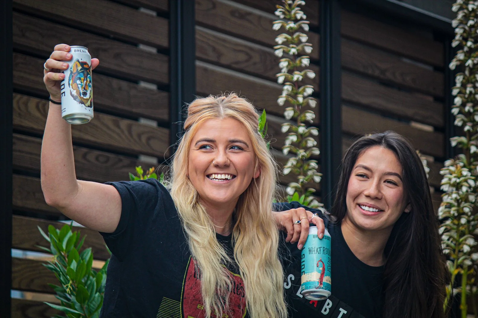
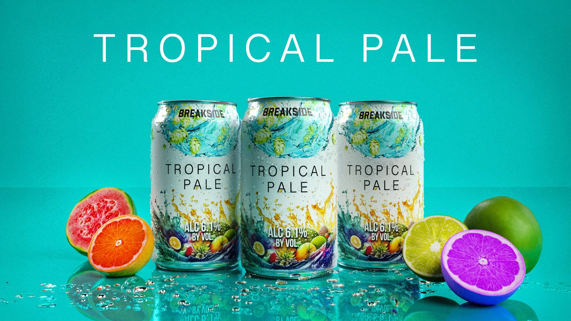
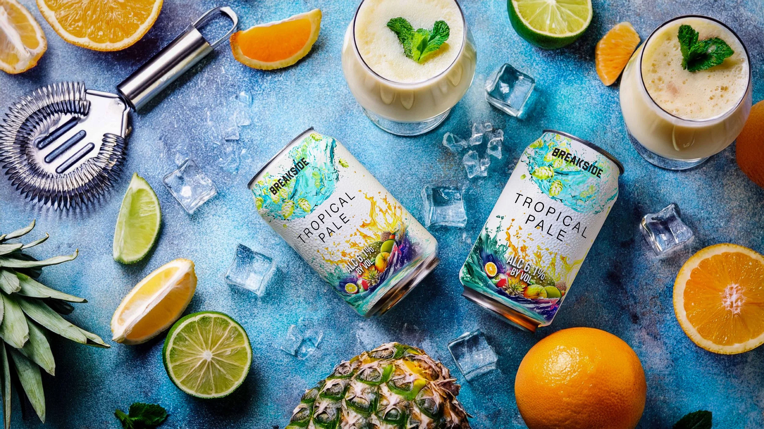
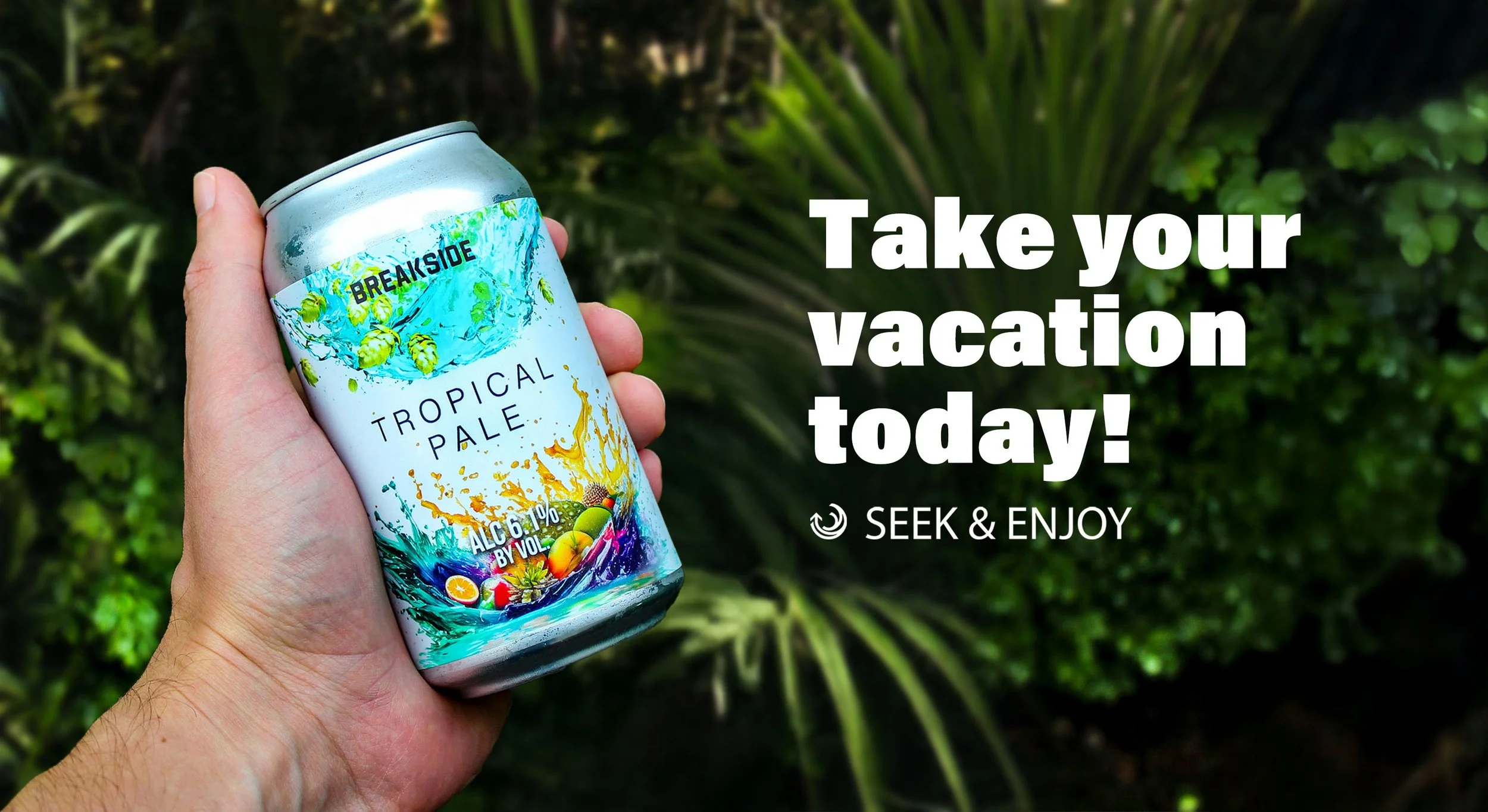
This Breakside Ad was a fun but challenging experience. I directed, shot and edited to show what could be done with minimal budget to highlight and focus on community.
Bringing the Strategy to Life
Messaging:
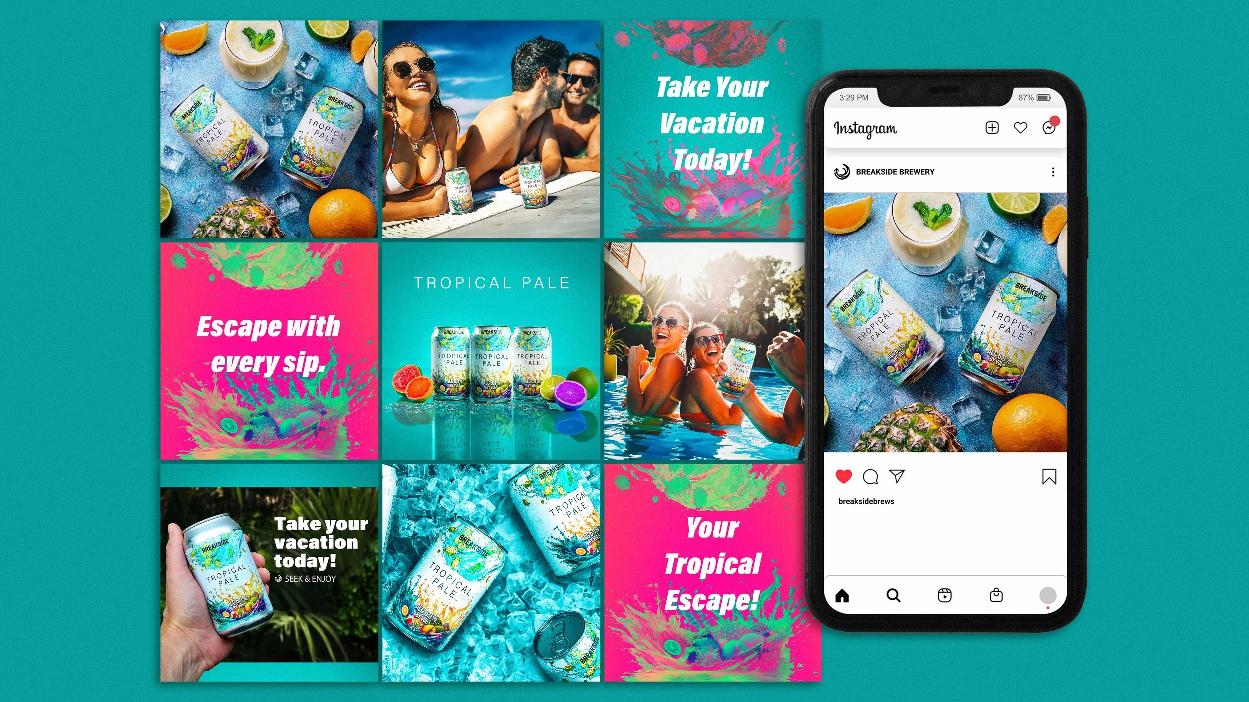
The same shift influenced how the brand communicated.
Rather than treating every channel the same, the messaging adapted to the customer's context.
In the taproom, communication could lean into experience—community, discovery, conversation, and the culture surrounding craft beer.
In retail, messaging needed to work much harder in much less time. It focused on clarity, recognition, and helping customers make confident decisions in just a few seconds.
One idea remained consistent across both environments:
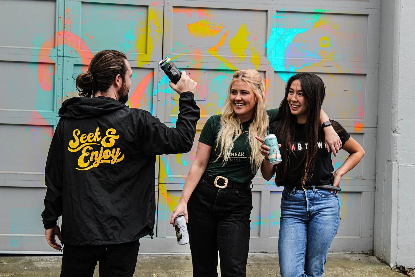
“SEEK & ENJOY”
More than a tagline, it is the guiding principle for the brand's voice. It encouraged curiosity without feeling exclusive and reflected the approachable, community-oriented personality that had always defined Breakside.
Whether someone was discovering a new seasonal release in the taproom or picking up a six-pack from a grocery shelf, the message remained the same: craft beer should feel inviting, exploratory, and worth sharing.
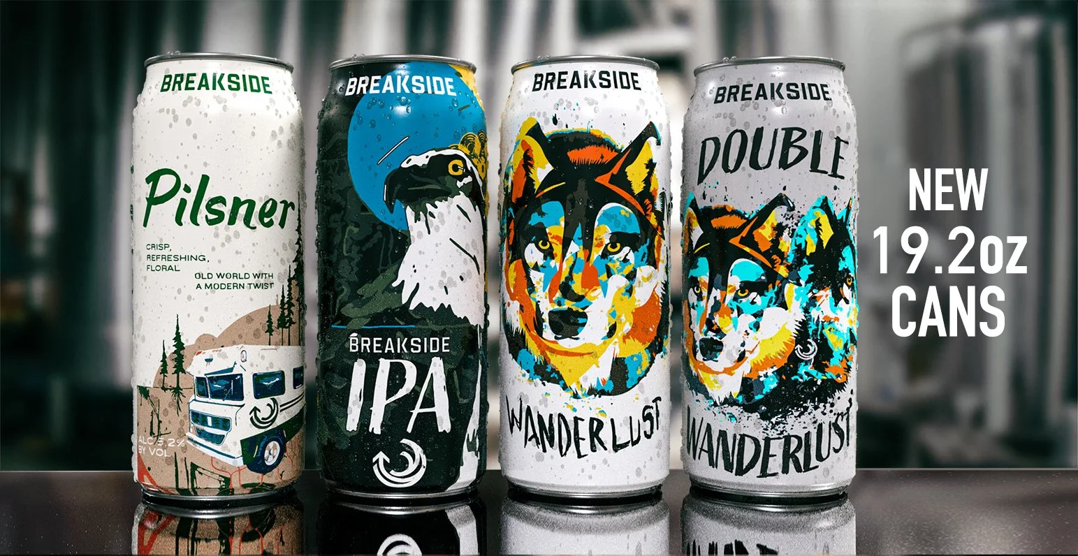
Packaging:
Packaging became more than a container—it became the customer's first conversation with the brand.
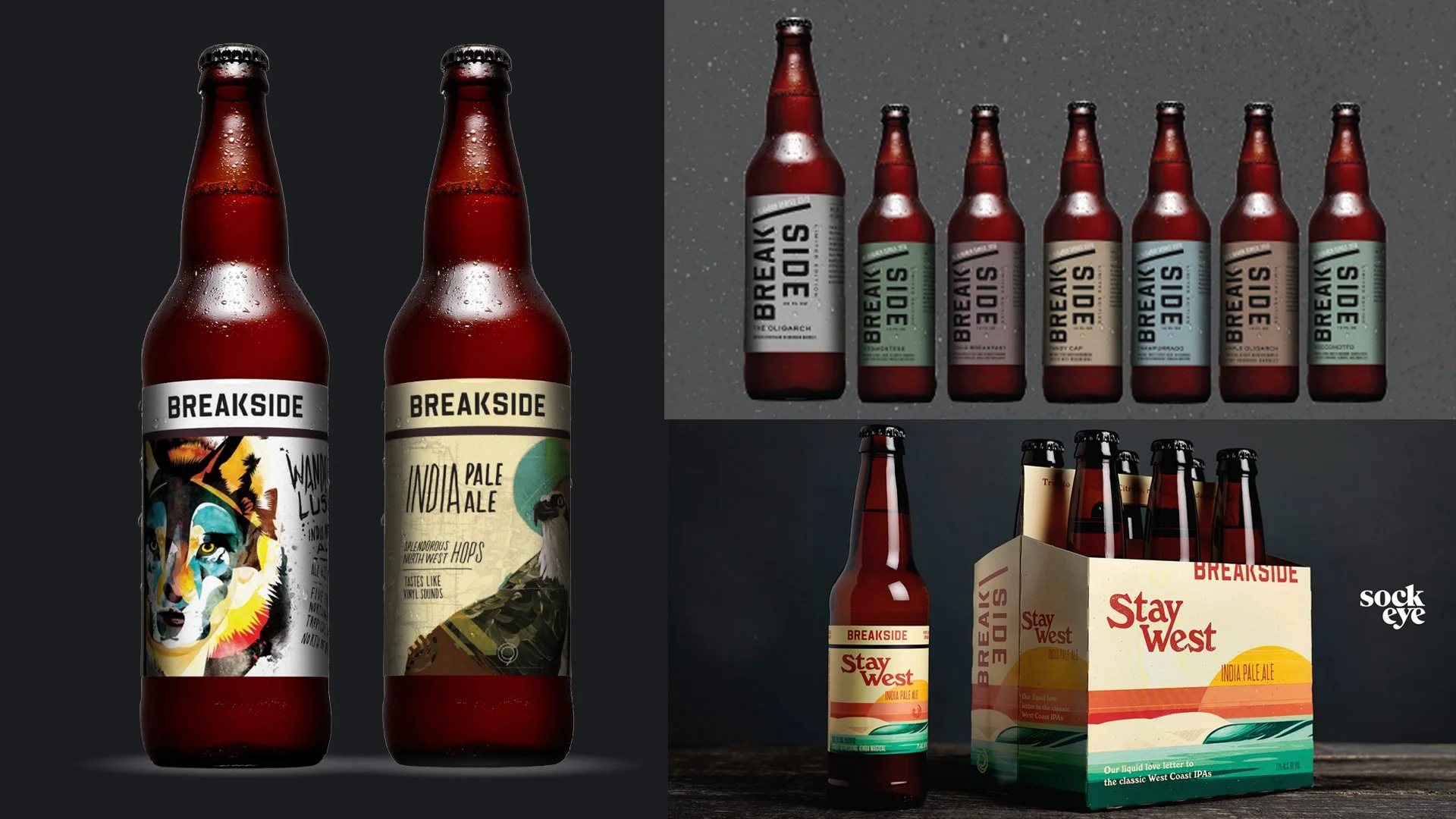
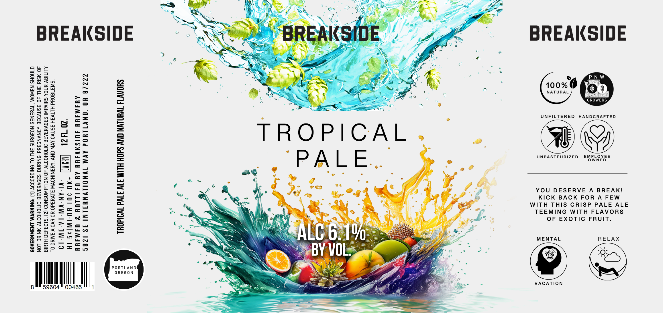
The label system was refined to improve clarity across an expanding portfolio while maintaining the expressive artwork that had become part of Breakside's identity.
Every can needed to communicate three things at a glance:
What the beer is
That it's unmistakably Breakside
Why it's different from the products beside it
The design system made it easier for customers to navigate the product line without sacrificing the character that defined the brewery.
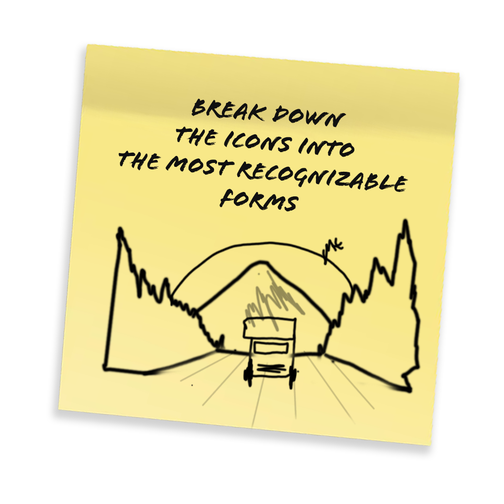
Process:behind the designs

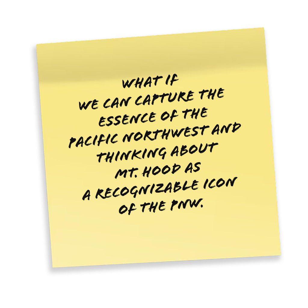



Translation
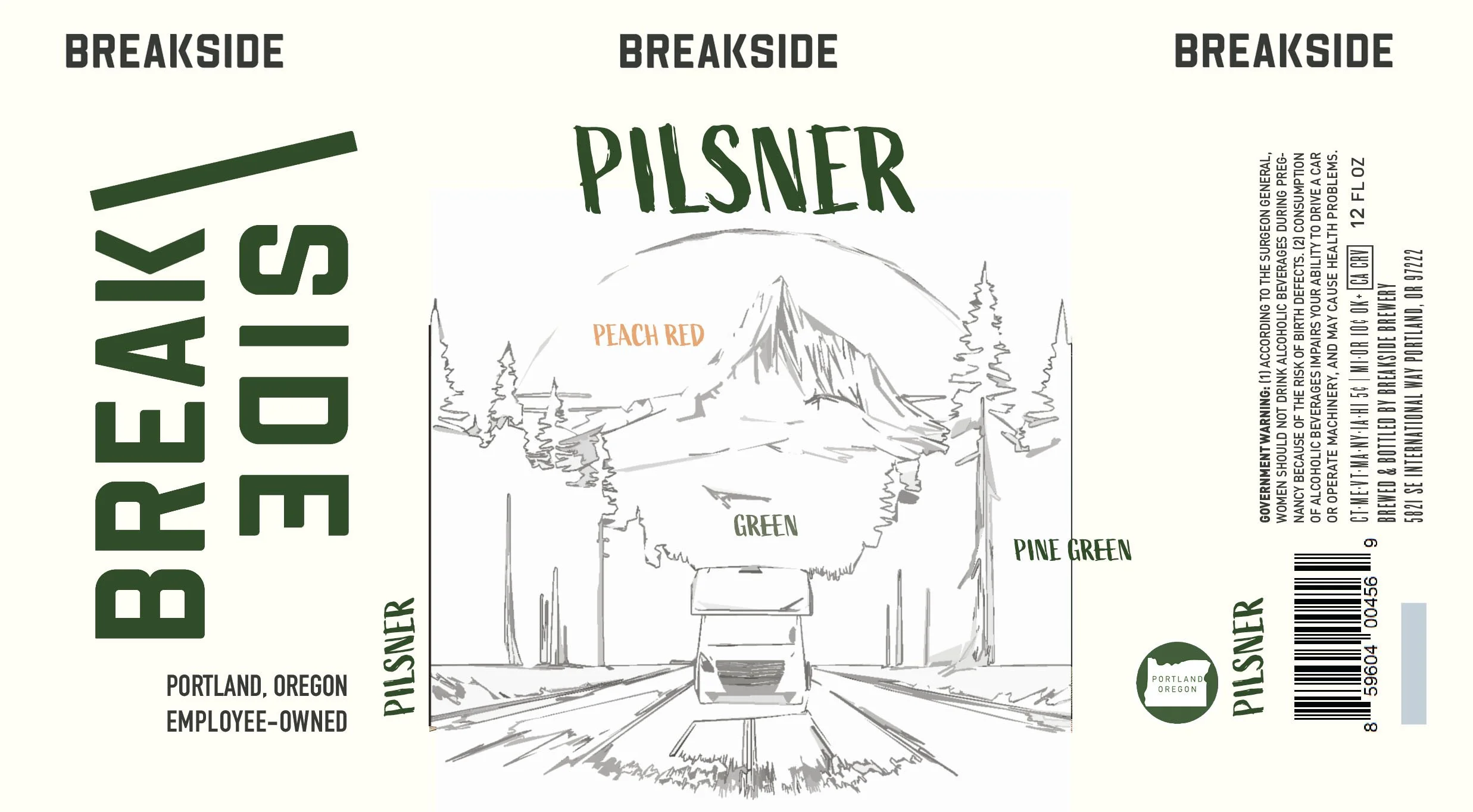
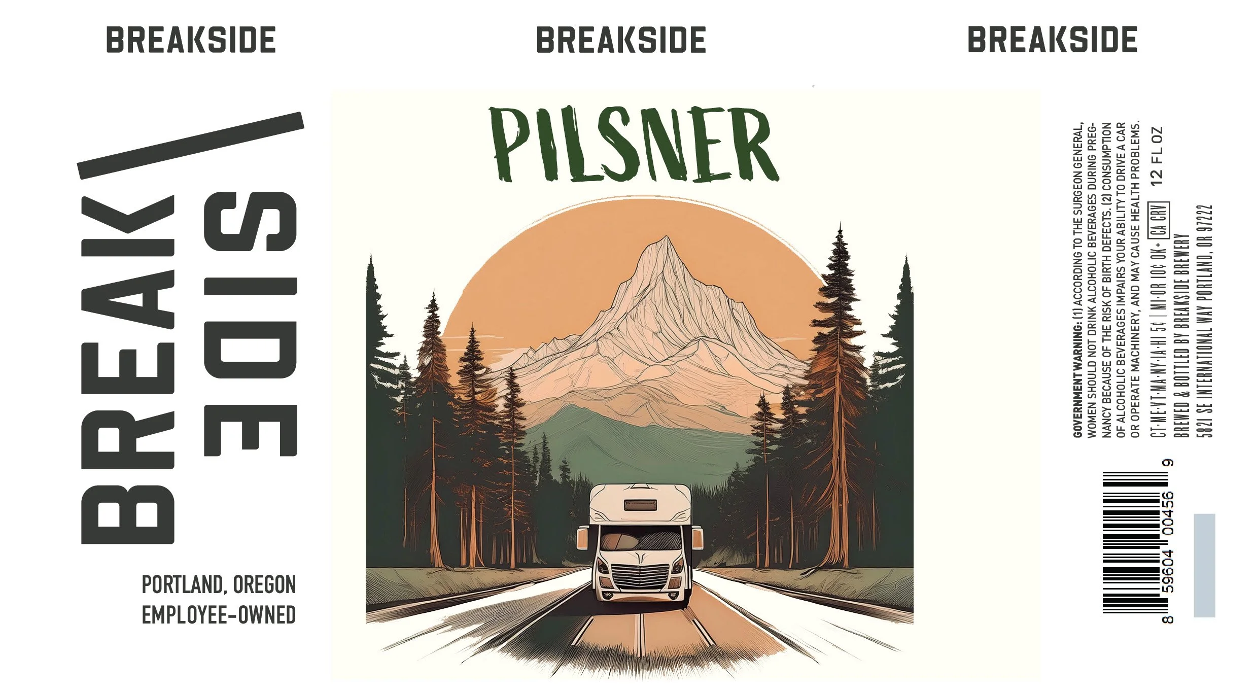
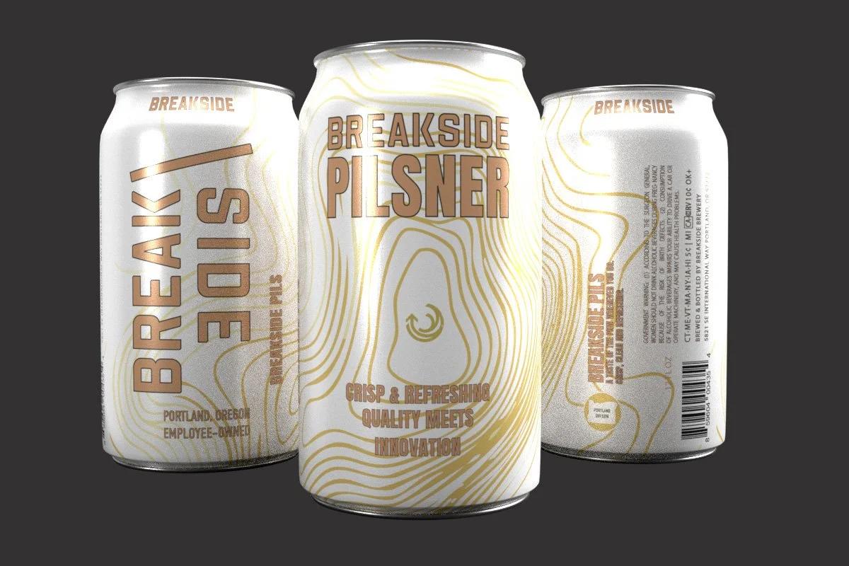
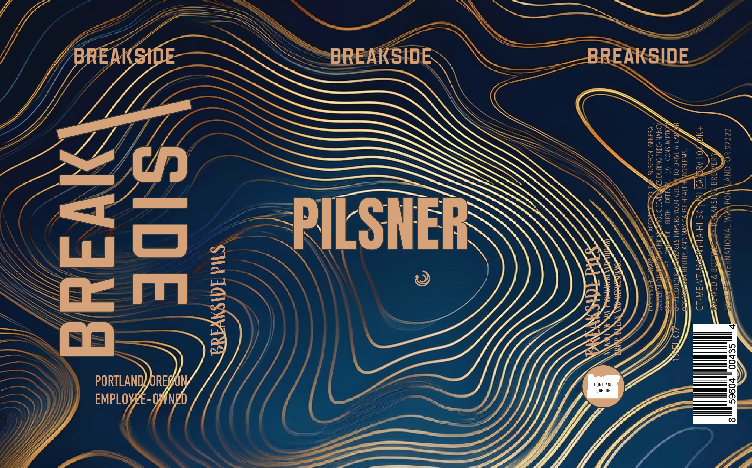
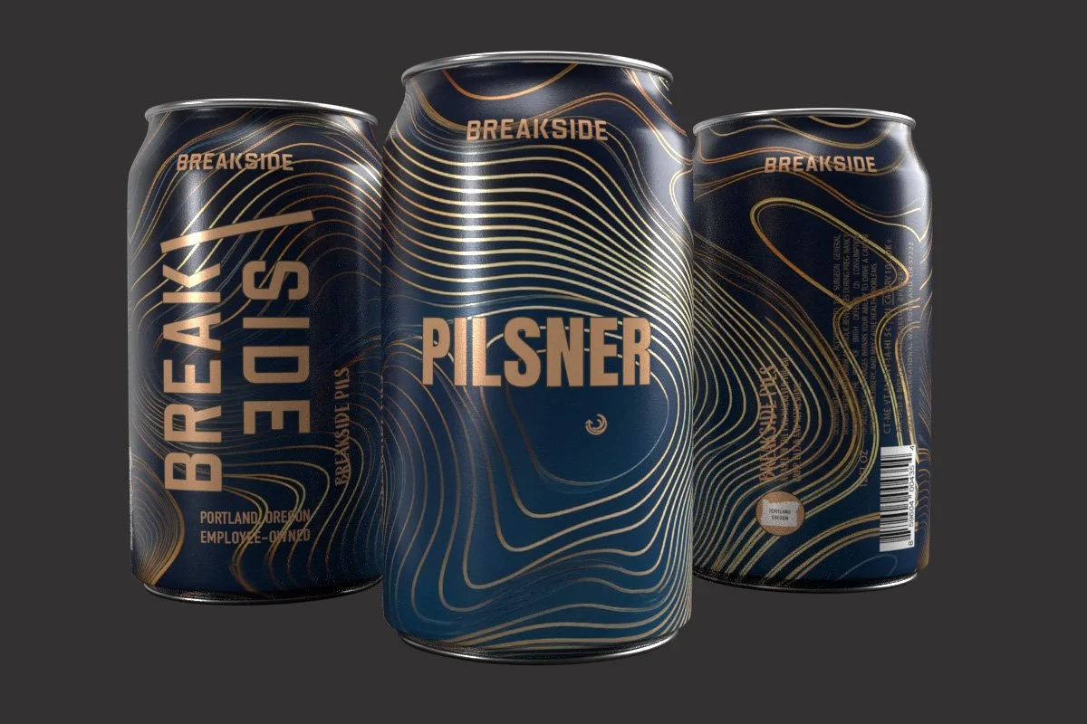
Many of our classic core product labels already had amassed a huge following and so it was my job to find the essence of that original artwork, translate and update it to meet the business objectives.
Exploration
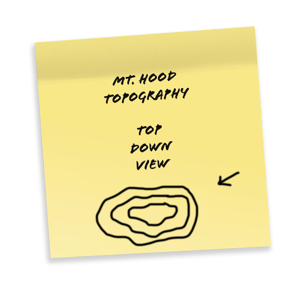
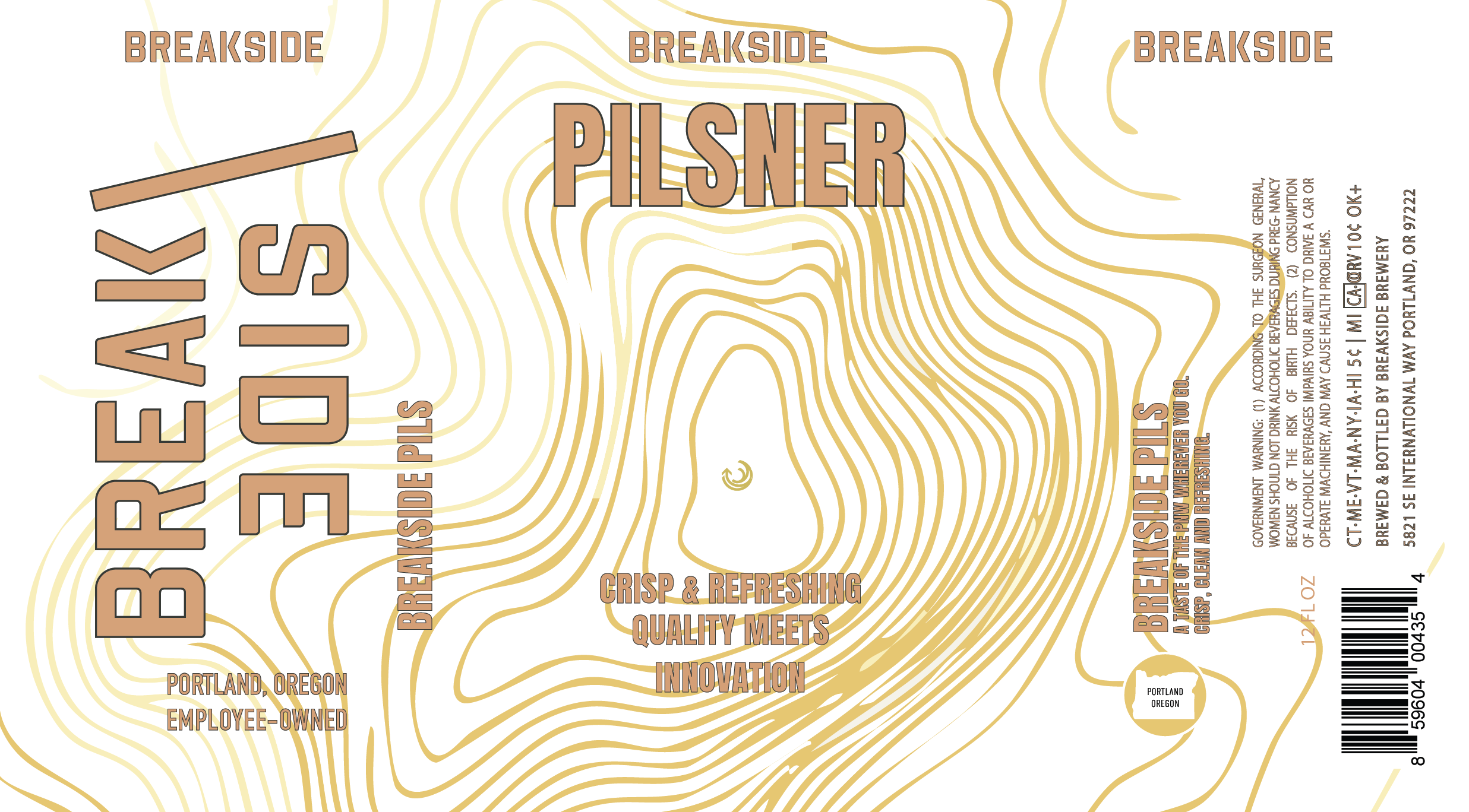
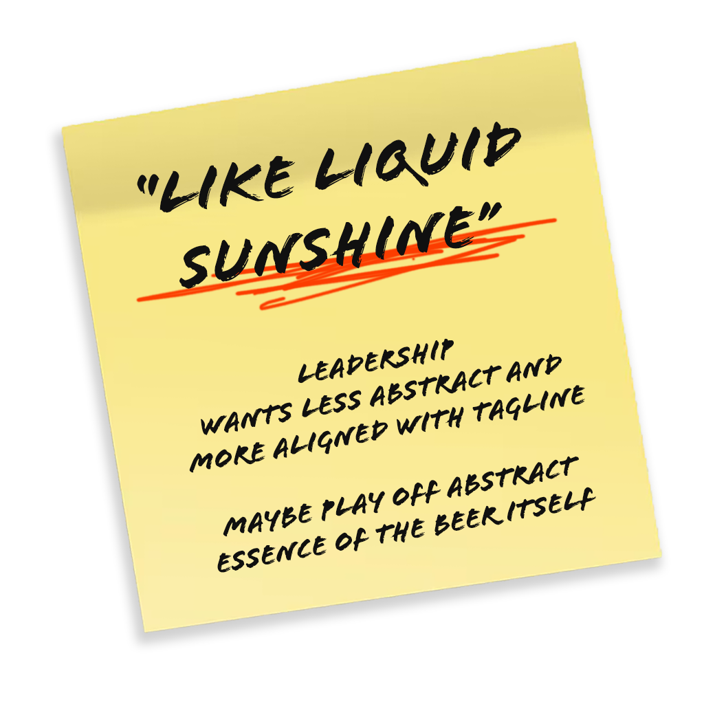
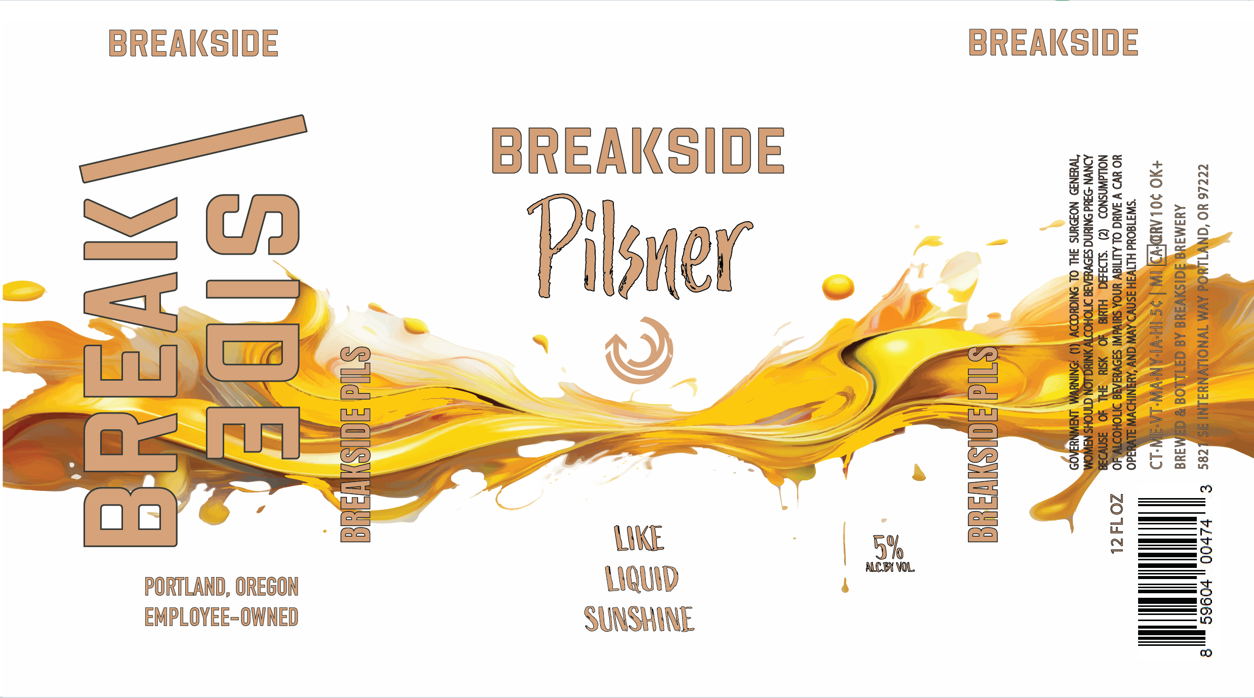
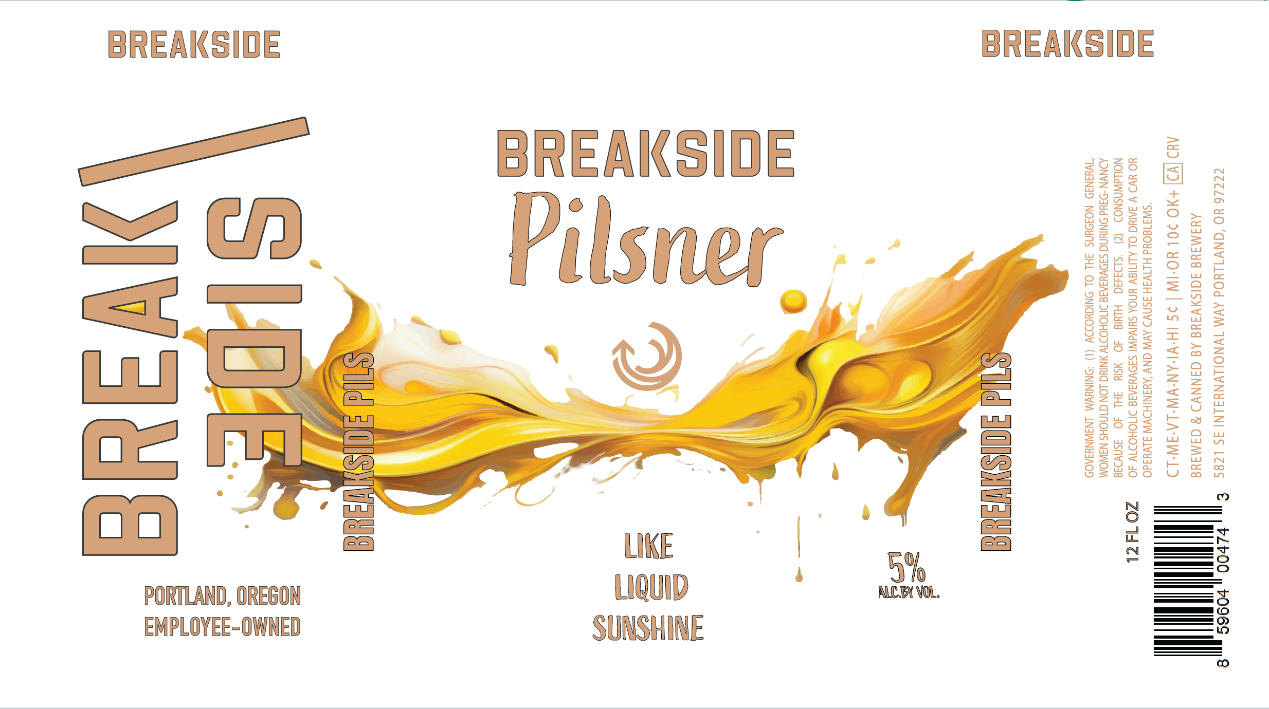
With the brand’s essence defined, we begin to test its limits. This phase is about deliberate experimentation and stretching the boundaries to see how far they can bend without breaking. I explored many different elements capturing the Pacific Northwest, pine trees, mountains topography. By exploring diverse creative territories I discovered unexpected design solutions. Hence, when I was encouraged to truly stretch and lean into the essence of the Pilsner itself, I was inspired by the golden/yellow flow that would give a refreshing feeling when you looked at it. I wanted something that enticed and appealed to the refreshing drink inside.
Refinement
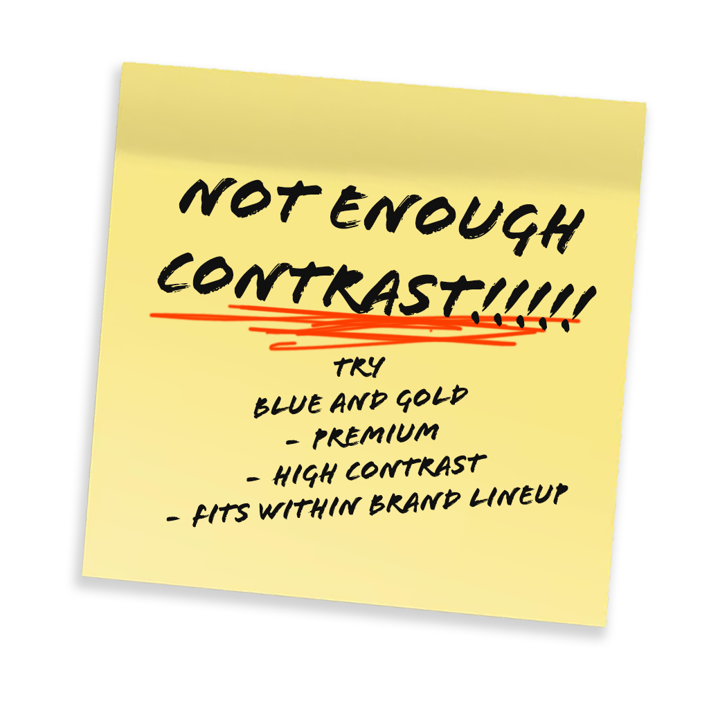
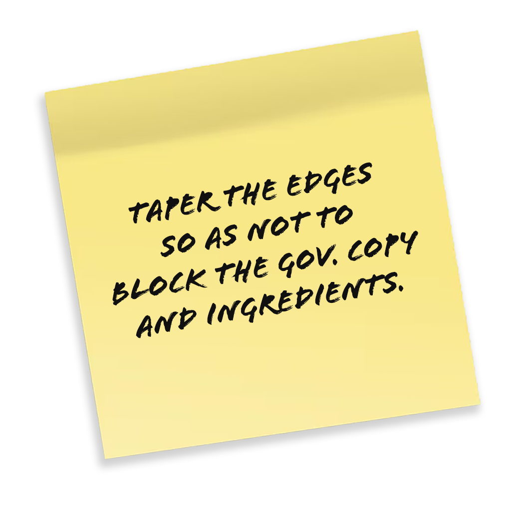
Once leadership decided on a look and direction, it was all about making small but necessary refinements to meet the objectives for the brand. This meant designing clear signals for our customer base that instantly; help them identify what kind of beer it is, what feeling to expect, and even the use of negative white space was created to give a sense of “pure, and clean” aspect as Pilsner beer is very light and has few ingredients to hide behind. In the end, it resulted in a design that could easily be identified on store shelves while cohesively making a great addition to the brand lineup.
Building a Scalable Brand System
Situation:
During COVID, Breakside experienced a dramatic shift in its business model.
Historically, the business revolved around the taproom, where limited-release beers could each have their own identity, personality, and messaging because customers experienced them one at a time.
Almost overnight, production flipped.
Instead of being primarily a taproom brewery, Breakside became a packaged goods company competing on crowded retail shelves.
Products that once lived independently were suddenly sitting side-by-side with flagship beers and dozens of competitors.
The existing branding system wasn't built for that environment.
Observation:
The brand was behaving like a collection of individual products instead of a recognizable portfolio.
Each seasonal beer had developed its own visual language.
That worked in the taproom.
It became confusing in retail.
At the same time, supply chain shortages created another constraint.
The industry was competing for the same printed cans, increasing costs and reducing flexibility.
Insight:
Retail shoppers don't experience products one at a time.
They experience portfolios.
Recognition happens before individual product selection.
If every package behaves like a different brand, the parent brand loses equity.
The supply shortage wasn't just an operational problem.
It was an opportunity to rethink the visual system.
Strategic Decision:
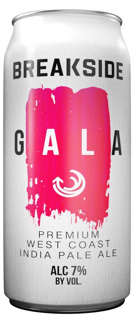
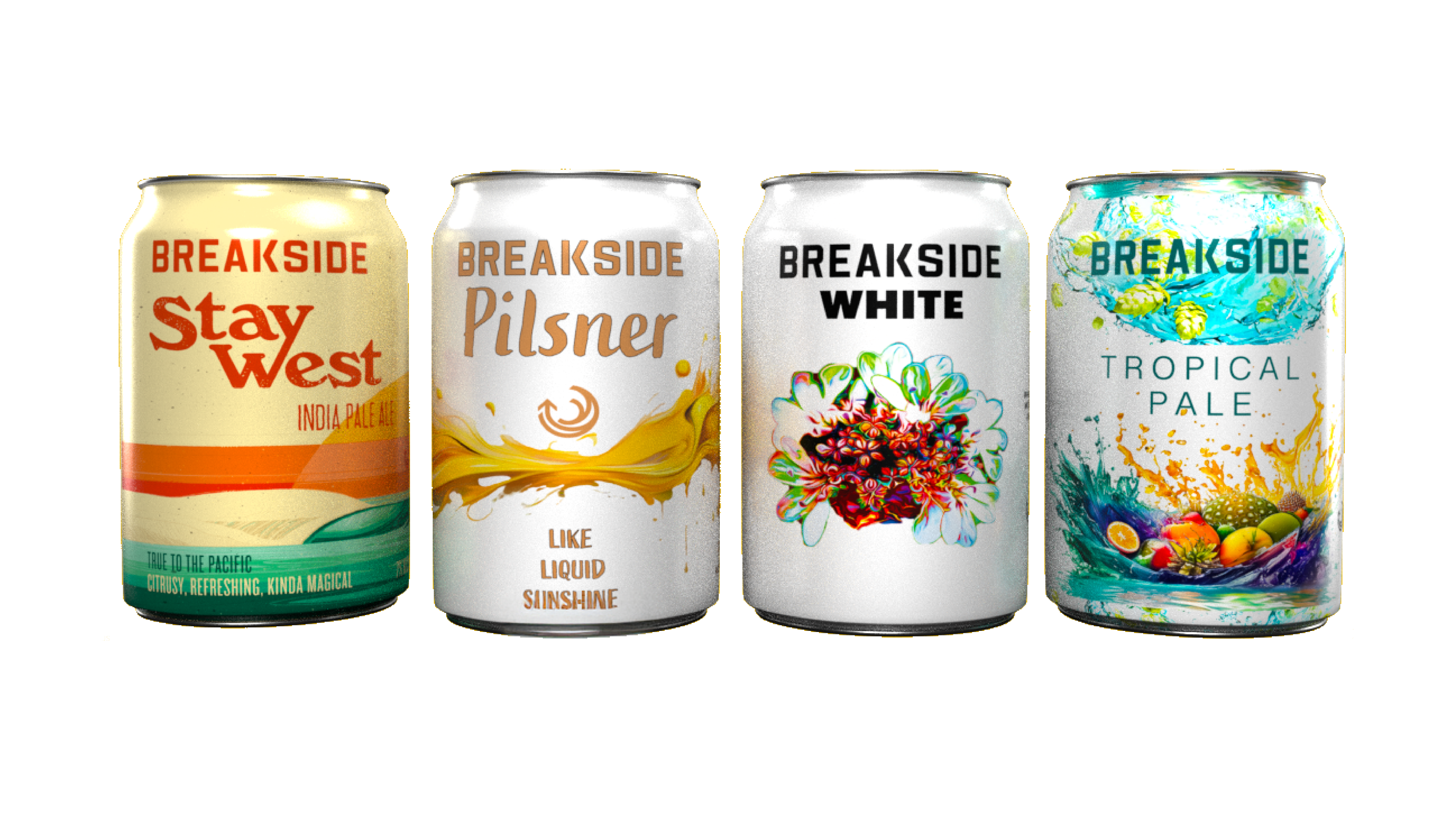
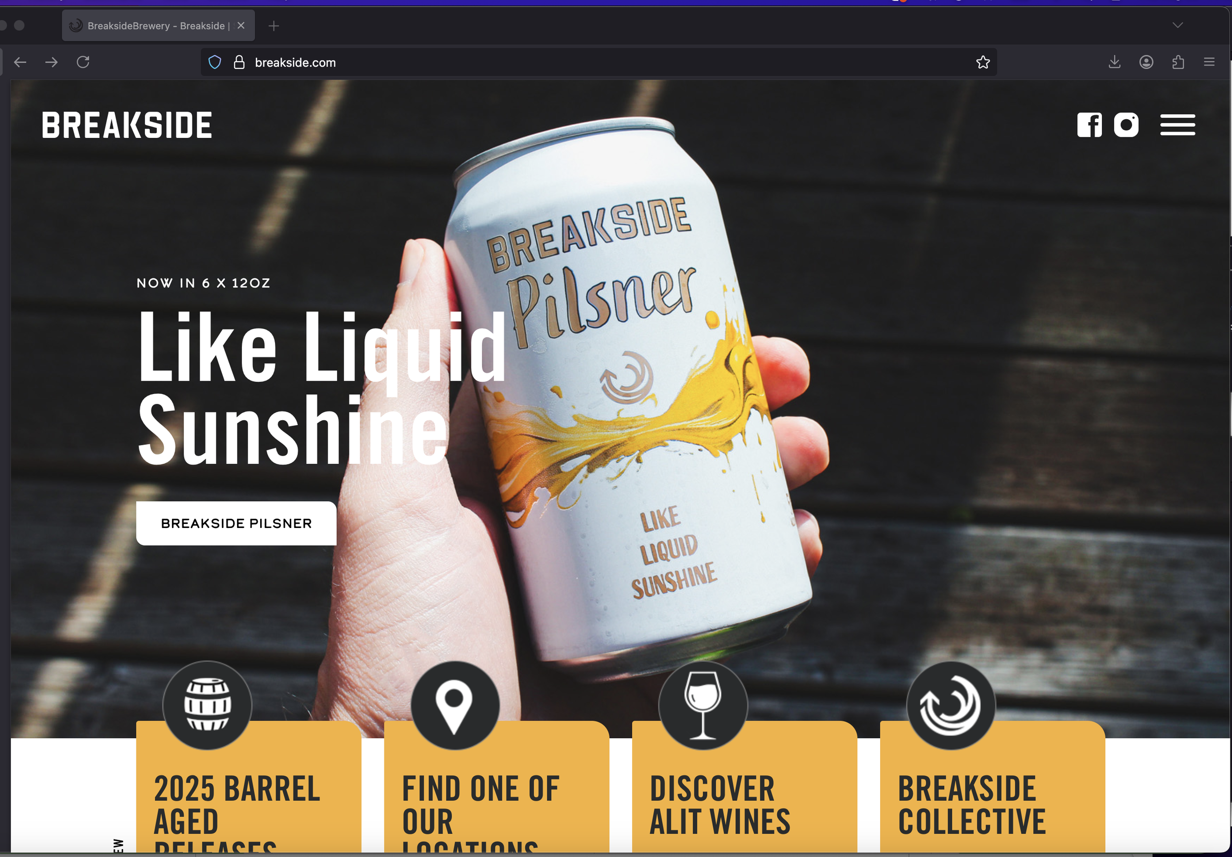
We standardized the brand architecture by making the Breakside logo the consistent anchor across every product.
At the same time, I proposed adopting white-coated cans as a deliberate signature rather than treating them as a cost-saving compromise.
Instead of hiding the limitation, we turned it into a recognizable visual asset.
Execution:
* Developed a consistent packaging hierarchy centered around the Breakside master brand.
* Unified seasonal and core products within the same visual system.
* Created a recognizable packaging framework while allowing each beer to retain its own personality.
* Shifted production toward white-coated cans as a repeatable brand element.
* Extended this consistency across future product launches as the system evolved.
Outcome:
The new system created stronger shelf recognition while reducing packaging complexity and production costs.
Customers began recognizing Breakside immediately in retail environments, with multiple customers commenting that the white cans made the brand easy to spot on crowded shelves.
More importantly, the work established a scalable brand foundation that supported continued portfolio growth instead of treating every new product as an isolated design exercise.
Strategic Principle:
A brand system should become stronger as the portfolio grows—not more fragmented.
Operational constraints can often become brand assets when they're approached strategically instead of reactively.
Breakside Brewery Brand Strategy highlights reel.